


Contents
We’re excited to share that Nestor has a new logo.
Over the past year, Nestor has been evolving in ways that go beyond feature updates.
The product experience has been redesigned, parts of the architecture were simplified, and AI moved from something planned to something users actively interact with when they search, navigate, and make decisions inside the product.
As those changes took shape, the question around the logo started resurfacing.
The old logo reflected structure and connection at a time when the platform itself was still being defined. It stayed with us through the early rebrand and through most of the product’s evolution.
But at some point, leaving it in place started to feel like a small contradiction sitting at the top of every page.
When we looked at the updated interface and the logo side by side, they didn’t fully belong to the same moment anymore. The product had moved forward but the logo was still representing an earlier version of us.
— Jose Gomes, Head of Product at Nestor

The redesign wasn’t tied to a marketing moment. It was introduced when the integration of AI was no longer conceptual, when it had become part of the platform’s architecture and interaction model.
Designing with Continuity
The logo redesign didn’t start with a blank canvas.
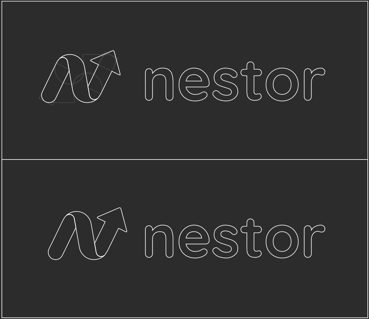
We went back to what was already there. The existing mark had a layered structure that visually read as a ribbon. That became the starting point.
The first concepts worked directly from that structure, keeping the ‘N’ and the overall form of the old logo while tightening the shapes and updating the colors to match the current brand system. The goal at that stage was modernization within familiar territory.
The first sketches were pretty conservative honestly. We were just asking, what does this look like if we tidy it up and bring it in line with everything else?
— Jose Gomes, Head of Product at Nestor
From there, the shape went through several iterations. The ribbon form was rotated and reworked, and as it developed it became rounder, slightly inclined, with depth achieved through gradient rather than layering. What emerged from that process was a form that does two things at once: read one way, it’s the ‘N’ for Nestor; read another, the same shape resolves into ‘ai’.
That double reading ended up being the most direct thing the mark could say about where Nestor is heading.
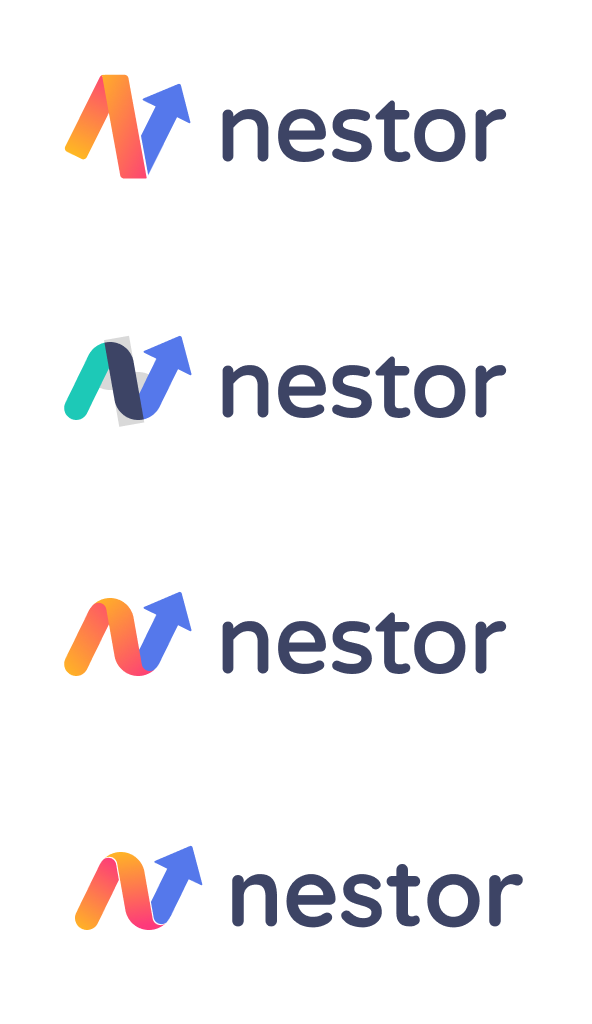
The shape ended up being more than just a modernized 'N'. The gradient gives it a three-dimensional quality, and the same form reads as 'ai' if you look at it differently. That duality felt right for where the product is going.
— Jose Gomes, Head of Product at Nestor
Typography and System Cohesion
The symbol wasn’t the only element revisited.
The wordmark was updated alongside it. The typeface is rounder and softer than the previous version, with spacing and proportions adjusted so the symbol and the name sit comfortably together. It’s a small shift on paper, but noticeable in practice.
We looked closely at how the wordmark behaves in different environments. It needs to work in the product, on the website, in presentations, in documentation. It's about consistency across the system.
— Jose Gomes, Head of Product at Nestor
Color followed the same reasoning. The old logo carried tones that had drifted from the updated brand palette; they weren’t wrong exactly, just out of step with everything around them. The new version draws directly from that system: the primary blue and the gradient already used inside the product to reference AI.
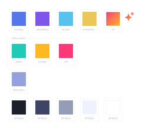
Nothing was introduced that wasn’t already there. The logo now speaks the same visual language as everything around it.
Aligning the Identity with the Product
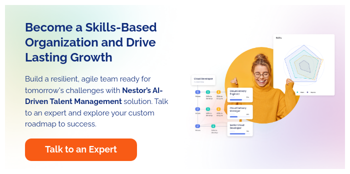
Nestor started as a skills management platform: a place for HR teams to map competencies, track development, and build frameworks for their workforce. That’s still what it does, but the way it does it changed considerably over the past year.
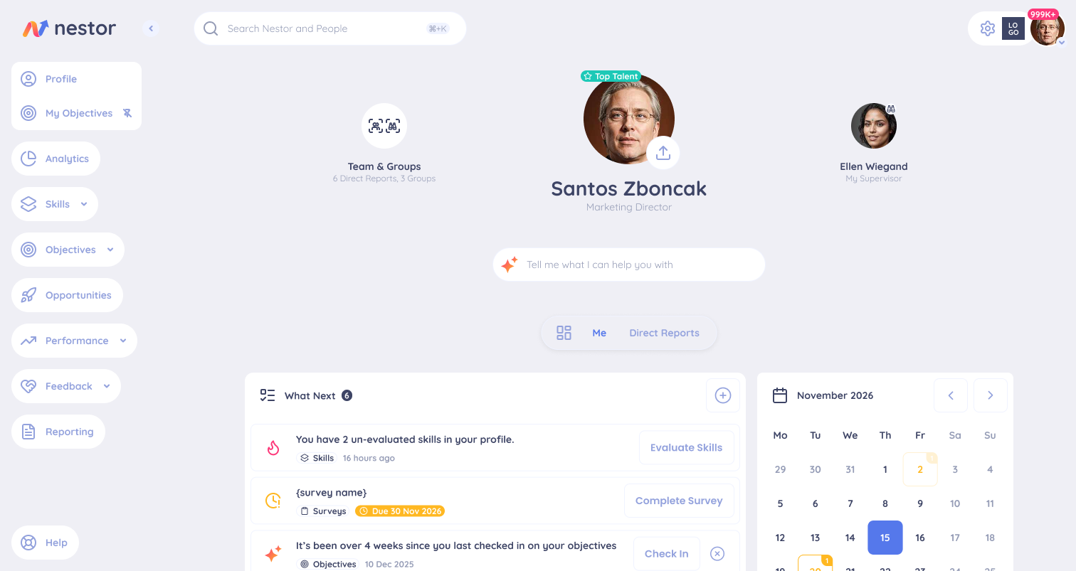
AI moved from a planned capability into something embedded in the daily workflow. Skills taxonomies that used to take weeks to build manually now generate in minutes. Role matching, career path recommendations, learning suggestions, these became things the platform does actively rather than things users configure. The product got faster, more autonomous, and more opinionated about how it surfaces information.
That shift showed up in the interface too. The home screen was redesigned to reflect a product that was doing more; more proactively, with less setup required from the people using it. For anyone who had been using Nestor for a while, logging in started to feel different.
The logo needed to feel consistent with where the product actually is now. The platform is more focused, more intentional in how it surfaces information, and the identity needed to reflect that.
— Jose Gomes, Head of Product at Nestor
Most users won’t think about the logo consciously. They’ll notice it changed, maybe pause for a second, and move on. But brand identity works beneath that level. It shapes the overall impression of a product before anyone has formed a deliberate opinion about it.
When the logo, the interface, the colors, and the typography are all speaking the same language, the product feels coherent. When they’re not, something feels off even if nobody can name it.
Brand and product aren't separate conversations. What the product does and how it looks have to come from the same place, otherwise you're sending mixed signals to the people using it.
— Jose Gomes, Head of Product at Nestor
Why Now
When the rebrand started, the priority was the platform; the architecture, the interface, the AI capabilities that were being built into the core of how the product works. Those things had to land first. The logo was always going to come after.
We always knew where it fit in the sequence. It's like the last piece of a puzzle. You can see the picture before it's in place, but it's not complete without it.
— Jose Gomes, Head of Product at Nestor
The timing ended up being the Christmas break. A slower period that gave the space to revisit earlier explorations without the pressure of an active sprint. The sketches from earlier in the year came back out, this time with a clearer picture of where the product was landing.
By that point, everything was coming together. The AI features were live and the brand system had been fully defined. The logo was always going to be the last element, not because it was deprioritized, but because it needed the rest of the picture to be complete before it could be finished.
Final Thoughts
The new logo isn’t a promise of what’s coming. It’s a reflection of what’s already changed.
The platform has evolved in how it does what it does, and the identity now matches that.
For Nestor, the logo carries something specific: the ‘N’ that has always been there, and the ‘ai’ that is now central to how the product works. Both are present in the same form, without one overpowering the other.
That balance is deliberate as Nestor is still the platform it was built to be, now with the intelligence to do it better.